PCA Loadings Plot
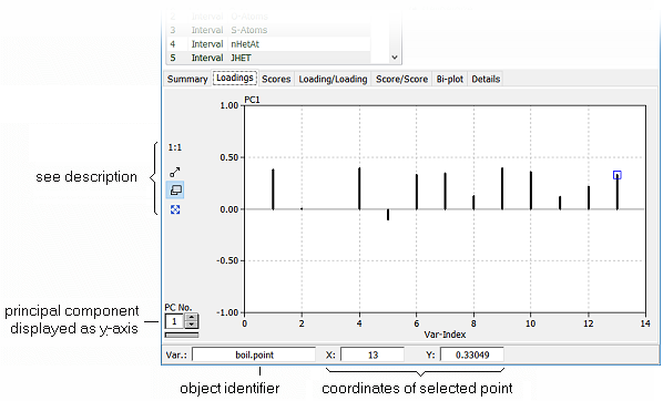
The tab Loadings shows the loading-vector of a particular principal component as a spectrum plot. The x-axis represents the variable index (which corresponds to the column index of the data matrix), the y-axis shows the loadings (eigenvector elements) of the selected principal component.
| Hint: |
If you want to know which spectrum line represents which variable, you simply move the mouse cursor over the interesting line. The variable name along with the coordinates of the selected line are displayed in the info box at the bottom of the PCA window. |
Left to the loading diagram there are several controls for changing the display options. In addition to the selection boxes for choosing the principal components to be displayed there are two buttons which provide the following functionality:
| show all data |
 |
Clicking this button sets the zoom factor to the standard value so that all loadings are shown in the diagram. |
| mouse action |
Depending on the state of this button (indicated by its icon) the mouse can be used for zooming, panning, or marking the data. Clicking the button toggles its function: |
| |
|
 Window: any rectangular region of the chart can magnified to fit the full area of the chart by simply pressing and holding down the left mouse button at one corner of the region. Moving the mouse now shows a rubber band rectangle. The area of the rectangle is blown up to the full chart area when the left mouse button is released. Window: any rectangular region of the chart can magnified to fit the full area of the chart by simply pressing and holding down the left mouse button at one corner of the region. Moving the mouse now shows a rubber band rectangle. The area of the rectangle is blown up to the full chart area when the left mouse button is released.
 Drag: the scale of the chart can be increased or reduced by pressing and holding the left mouse button. The scaling factors of the x and y axes are changed in proportion to the movement of the mouse (up and right = magnify, left and down = reduce). Drag: the scale of the chart can be increased or reduced by pressing and holding the left mouse button. The scaling factors of the x and y axes are changed in proportion to the movement of the mouse (up and right = magnify, left and down = reduce).
 Pan: the visible part of the chart can be shifted by pressing and holding down the left mouse button. The chart follows the mouse movement which results in panning the visible window across the data. Pan: the visible part of the chart can be shifted by pressing and holding down the left mouse button. The chart follows the mouse movement which results in panning the visible window across the data.
|
|
 Features of DataLab

